Copyright and Permissions for Poetry Anthologies: What UK Editors Need to Know
October 10, 2026 - Poetry
You have the photographs. You have a title, a rough page count and a quote from a printer. What you may not yet have is a layout that lets the work breathe.
Photo books tend to go wrong quietly. Not with typos or a torn dust jacket, but with sequences that read like a filing cabinet, captions set so small they need a torch, and a horizon line that disappears into the spine. You seldom notice until the box lands on the doorstep.
The seven problems below account for most of the disappointment in independently published photo books. Every one is fixable, and most cost nothing more than an evening of rearranging and a second proof.
The commonest error is tidiness: all the portraits together, then all the landscapes, then the details. It feels organised and it produces a book that can be skimmed in three minutes, because nothing surprises the reader.
A sequence works by adjacency. Each picture changes how the next one reads. Place two near-identical frames side by side and you spend a spread saying one thing; separate them by forty pages and each gains weight. Rhythm matters too. A run of dense, busy images needs a quiet one after it — a single wide view, a near-empty page, a dark frame with one small light in it.
Build the sequence away from the computer. Print thumbnails, lay them on a table or the floor, and move them by hand. Then read the pile at speed, turning as a reader would. If you skim it, so will they.
Captions are the second voice in a photo book, and they should tell the reader something the photograph cannot: place, date, subject, or the fact that the building was demolished the following spring. A caption that simply repeats what is visible wastes the space it occupies.
Decide the rules early and keep to them. Will every image carry a caption, or only those that need one? Do they sit under the picture, or gather as a list at the back? Are they numbered? Consistency matters more than any single choice you make.
Size and measure are practical questions. Around 8 point is a sensible floor for caption text; below that it becomes decoration. Keep lines to roughly 40–70 characters so the eye doesn't lose its place, and avoid running text into busy areas of an image unless it is genuinely readable there. If everything in the book is untitled, say so once at the front and use a numbered index at the back instead of repeating the word two hundred times.
Pages do not lie flat. In a perfect-bound book the inner edge curves into the spine and swallows several millimetres of whatever is printed there. Full-bleed images are the obvious casualty, but the subtle damage is usually a face, a sign or a small detail that nobody can quite see.
Treat the inner edge as a no-go zone. As a rough guide, leave at least 10 mm of clear space from the trim on the inner side, and increase that as the page count grows and the book becomes harder to open. Ask your printer what they recommend for your chosen stock and binding — they will know how their presses behave. In layout software, set separate left and right master pages rather than one master with mirrored margins you have to remember to flip.
Readers see two pages at once. The right-hand page is the reveal after a turn, and the left-hand page is what remains in view while the eye travels there. Plan in spreads from the start and you will make better decisions about which image lands on a recto.
Watch for runs of the same shape. Nine verticals in a row, each with an identical margin, becomes wallpaper. Vary scale instead: a full-bleed spread earns the small picture opposite it. Don't pair two loud images face to face; they compete, and both lose. And keep an eye on the orphan — a single image on a left-hand page facing a blank recto. Sometimes that is a deliberate pause. More often it is what happens when nobody counted.
Bleed, safe margins and page counts are design decisions, not admin. Anything intended to run off the edge needs to extend beyond the trim, usually by at least 3 mm, or a fractional shift in the cutting shows a sliver of white. Text and important detail should sit well inside the trim, not up against it.
Page counts generally work in multiples of four, and offset printing often prefers larger signatures of sixteen or thirty-two pages. Knowing this early changes the edit, because you may need to lose eight pages or add them. Far better to decide that before the layout is finished than after the proof arrives.
The screen is backlit and generous. Blacks look deep, shadows hold detail, and a slightly warm grey reads as neutral. Paper behaves differently, particularly uncoated stock, which drinks ink and softens contrast in a way no monitor will show you.
Get a proof if you possibly can, and look at it in daylight rather than under a desk lamp. If the budget won't stretch to a full proof, print a few spreads at home on the nearest paper you can find, or ask to see the stock
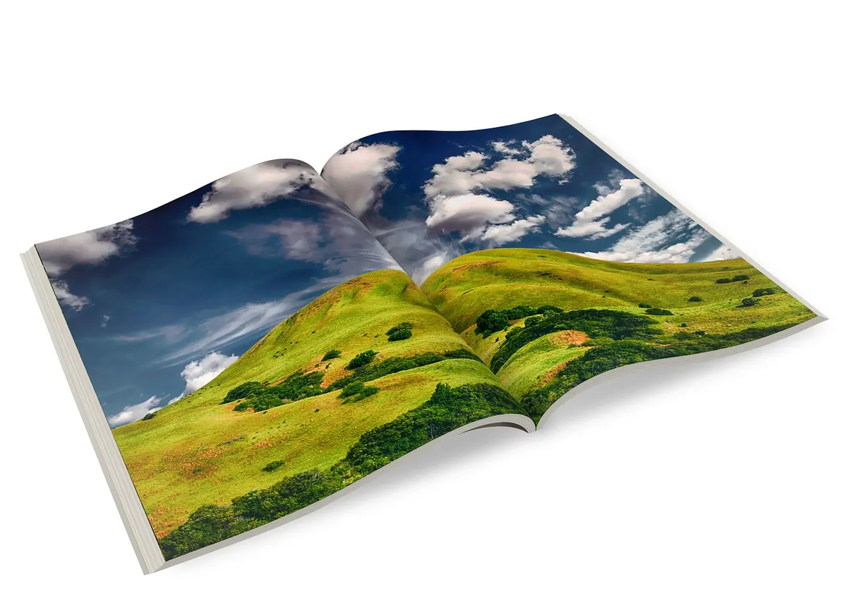
Photo: TheDigitalArtist / Pixabay
A practical guide for UK anthology editors on clearing poem rights, the narrow limits of fair dealing, and what a...

How UK authors can crowdfund a short fiction collection: build an audience first, cost the campaign honestly, design...
Copyright © 2026 Dune Press. All Right Reserved.